
Mobile App to Tackle Food Waste with Tools and Knowledge
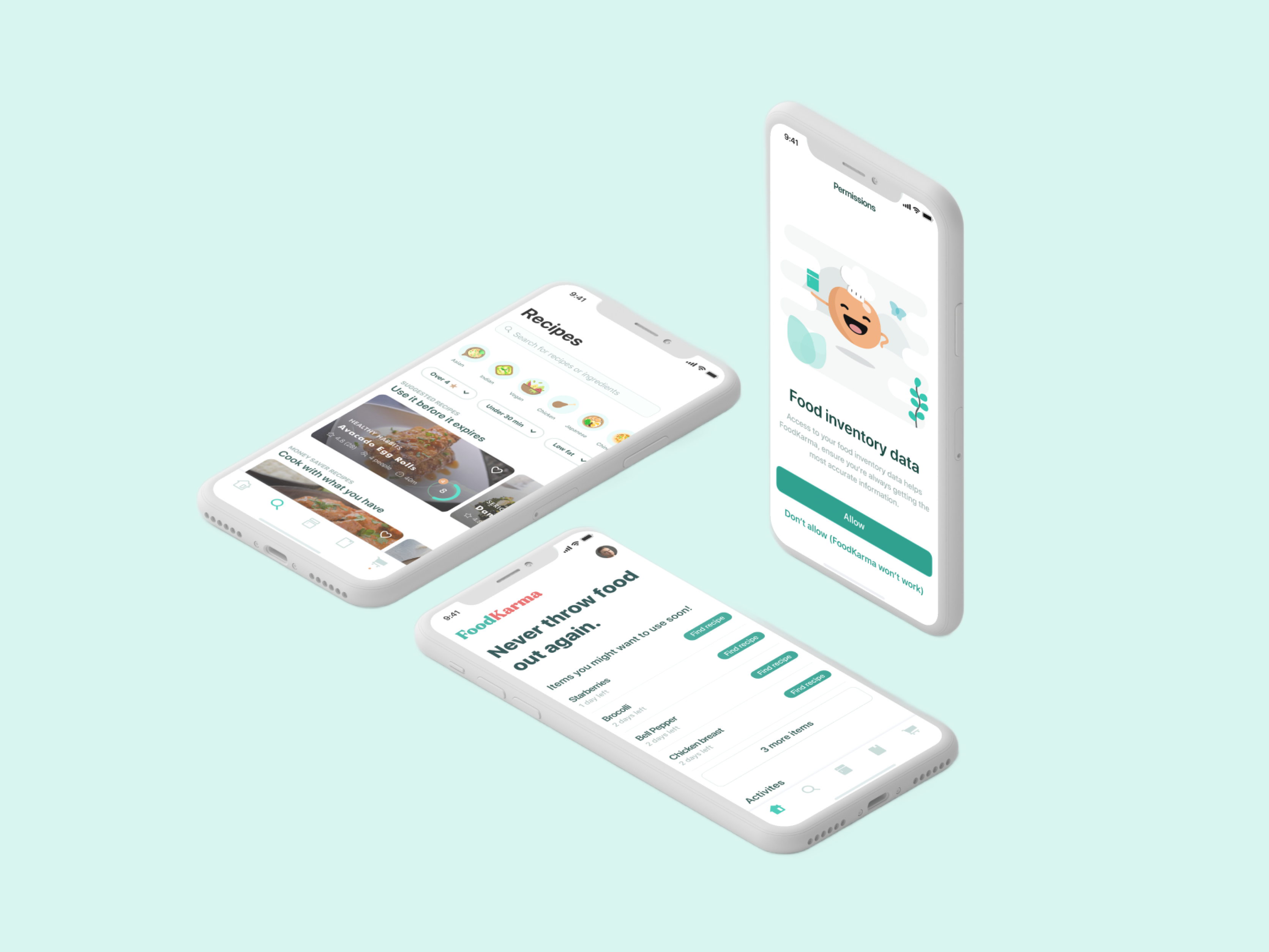
BACKGROUND
I noticed a significant rise in household food wastage, stemming from excess shopping and expired items. The issue prompted a realization that this not only impacts our budget but also contributes to environmental concerns. Motivated to find a solution, I delved deeper into the problem space to explore ways to address this challenge.
ROLE & DURATION
Product Designer
User Research, Branding, Interations, Visual Design, Prototyping & Testing.
Timeline: 6 months
DESIGN MISSION
FoodKarma's mission is to equip households with the tools and knowledge to combat food waste
- We will help households prolong their food inventory through food visibility and accurate inventory tracking.
- We will help households save time and encourage home cooking by timely revealing dynamically curated recipes.
- We will help households master food efficiency through education and awareness.
- We will help households conceptualize their financial impact when they waste food.
The Problem
Designing for Food Efficiency and Visibility
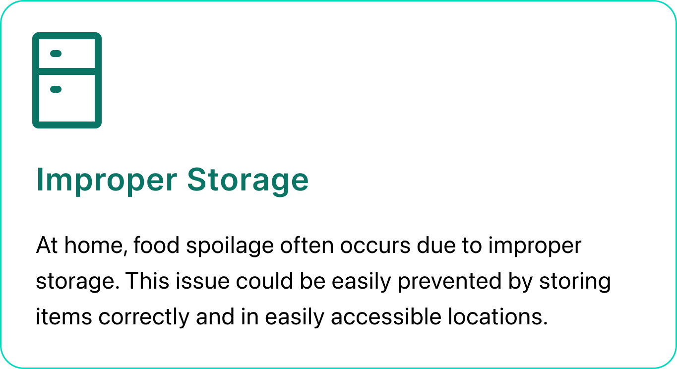
Food waste is a pervasive problem with economic, social, and environmental implications, serving as the leading contributor to methane gas. In developed countries like North America, 61% of food is wasted at the household level, with about 2/3 of this waste attributed to food not being used before it spoils. This results in 140 kilograms of wasted food per year for the average Canadian household, translating to a cost of more than $1,100 annually. This issue is often exacerbated by improper storage, poor planning, and a lack of visibility into household food inventory.
Design Challenge
How might we help households track and monitor their food inventory and be food efficient while saving time and encouraging home cooking?
UNDERSTAND AND DEFINE
Exploring User Behaviors and Market Dynamics
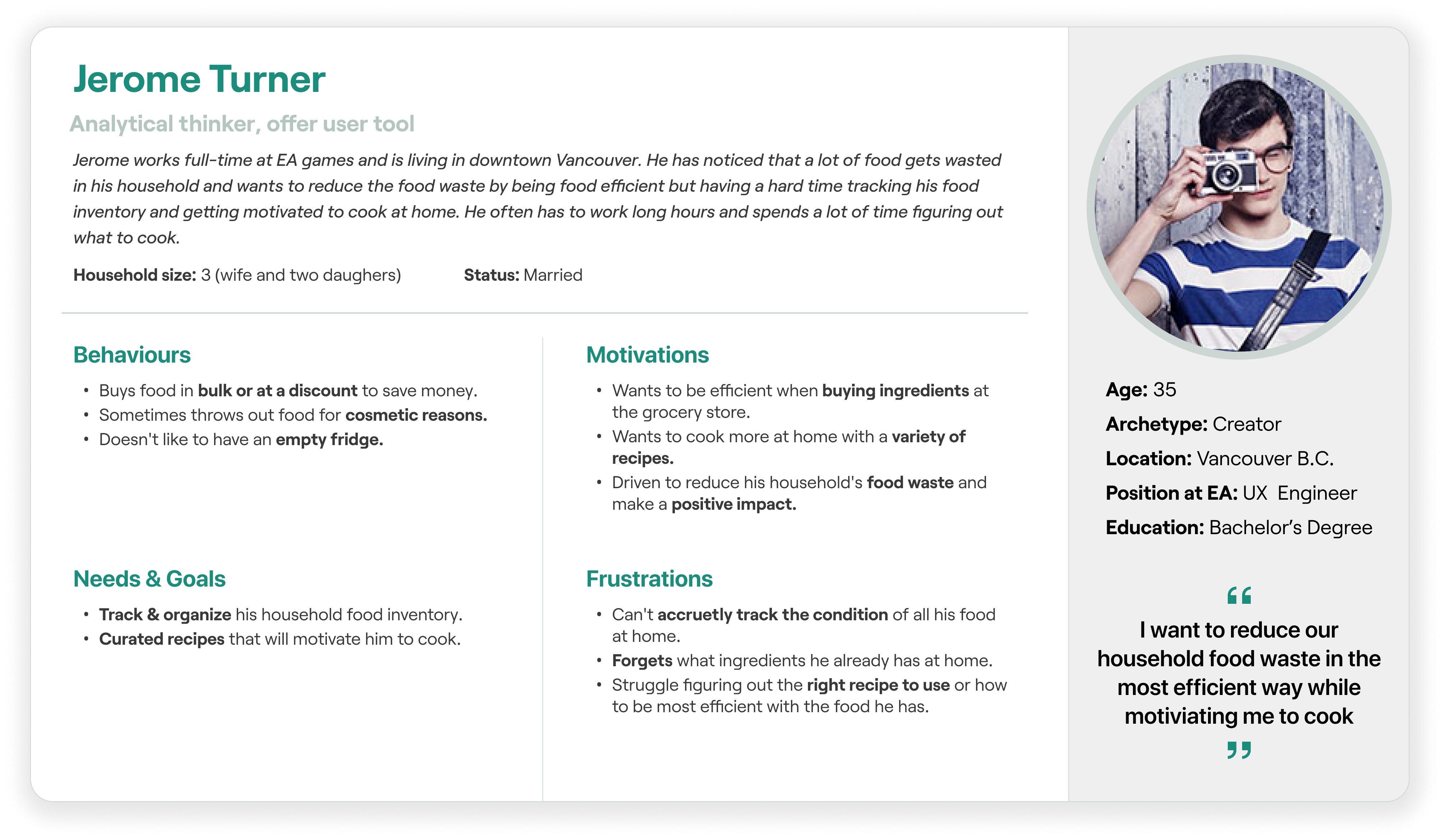
I dove deeper into the underlying issues to obtain a comprehensive understanding of household food waste. The journey began with user research, involving surveys to gather analytical data and interviews with potential users to uncover their pain points, motivations, behaviors, and goals. I conducted interviews with a diverse group of 10 individuals, comprising four males and six females, aged between 24 and 40.
Insights Gathered
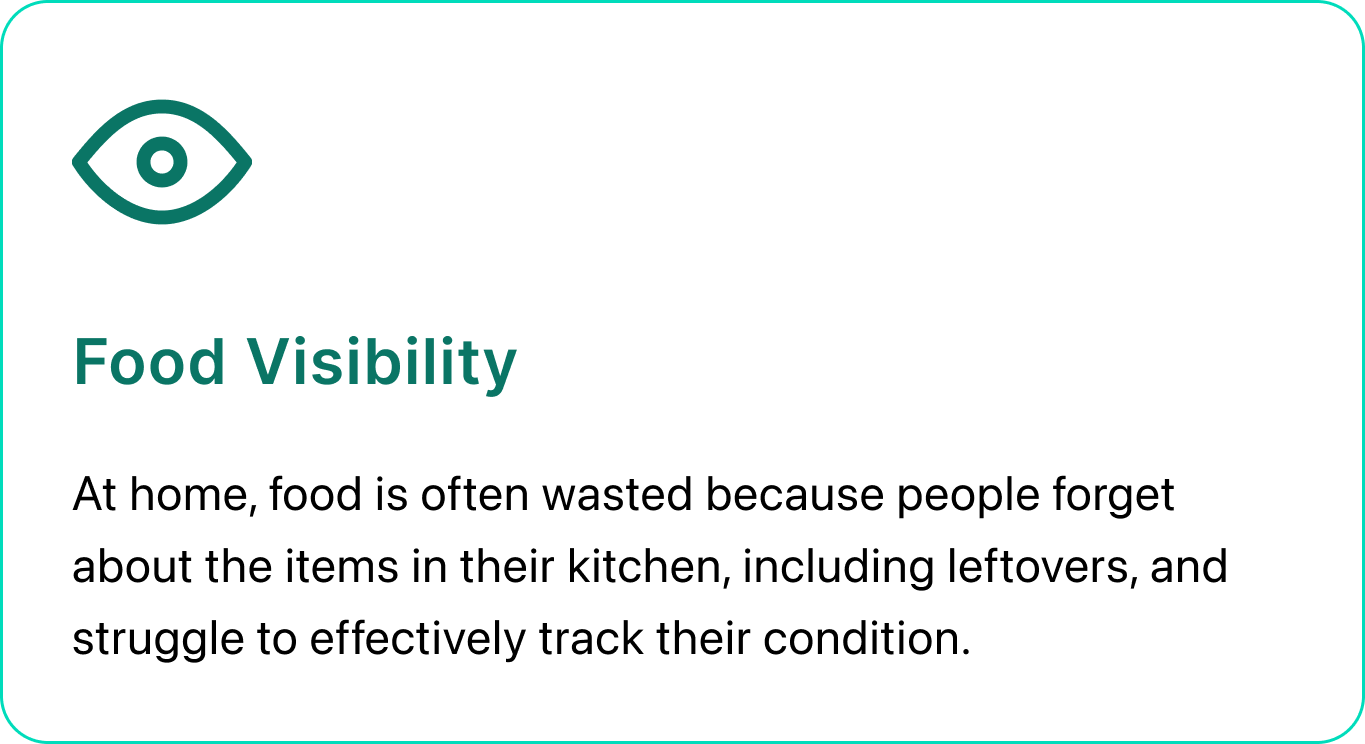
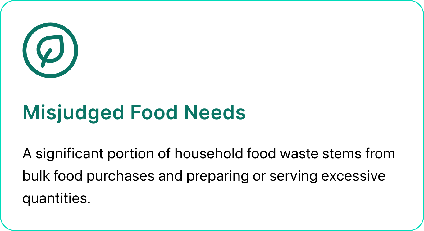
After conducting multiple user interviews, contextual inquiry, and analyzing the gathered data, I was able to categorize the insights into these 4 categories.
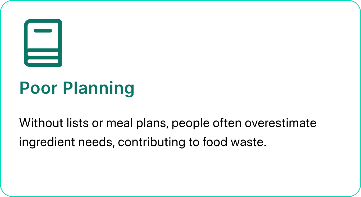
Research Artifacts
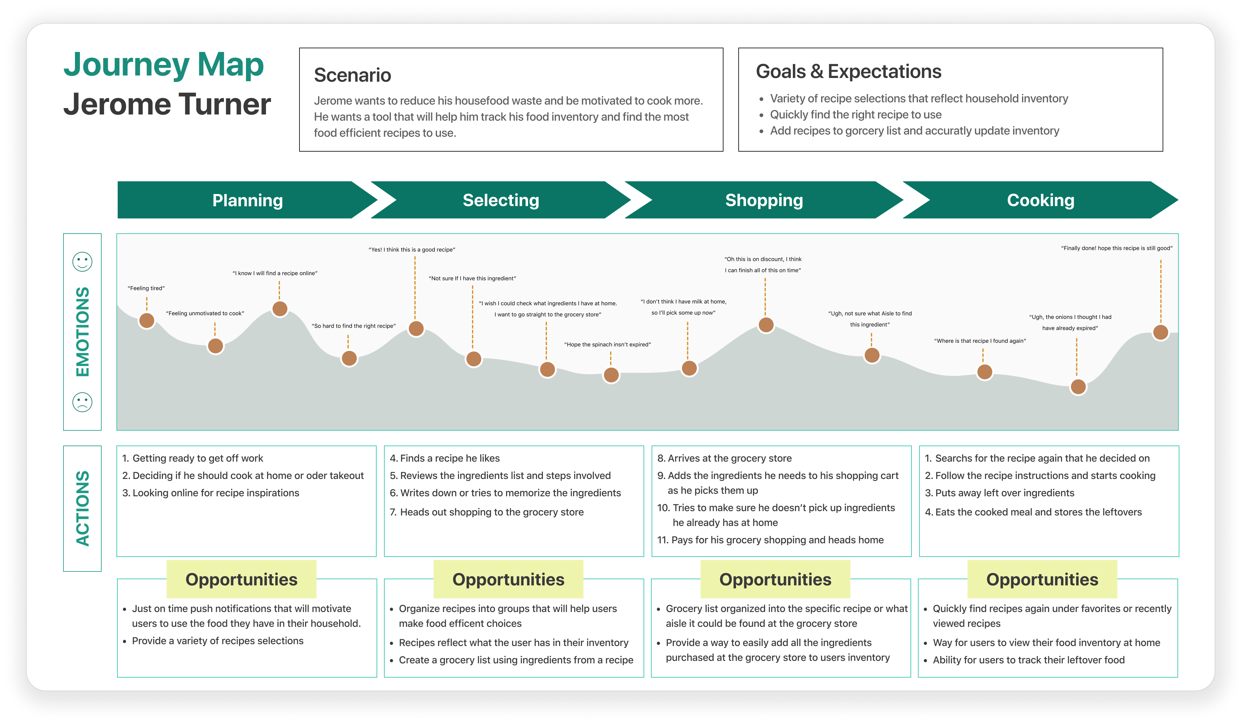
Journey Map
I outlined the stages individuals go through when planning and cooking a meal after work. This mapping process identified user behaviors, pain points, and potential opportunities at each stage. It also provided a logical order for discovering recipes and managing household food inventory
IDEATION
From Data to Display
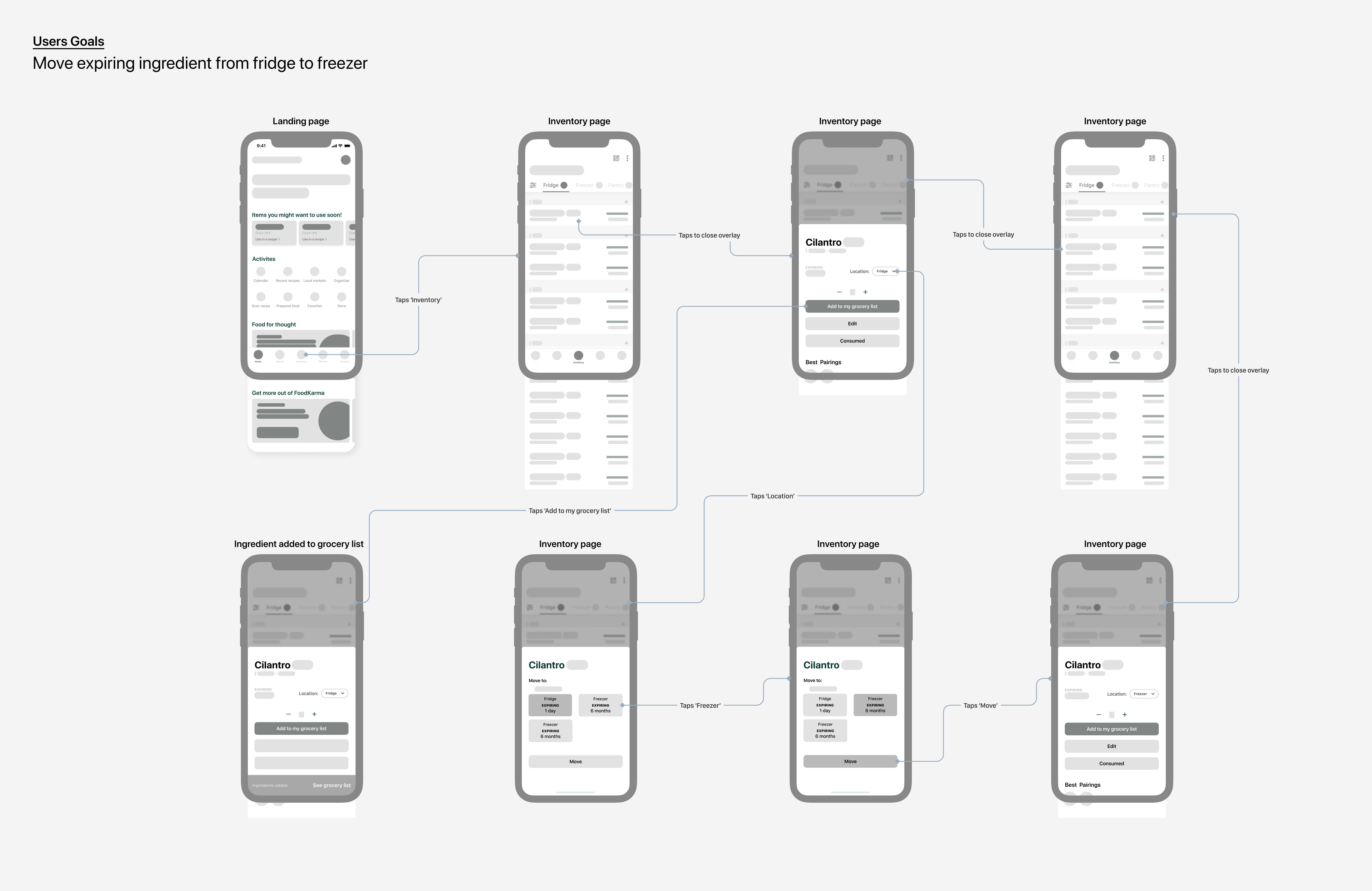
Sketches and Wireflows
I initiated the sketching process in FigJam using the Huion sketch pad, enabling me to swiftly express and explore potential design forms. After establishing basic concepts, I transitioned to greyscale wireflows to test and validate my ideas.
PROTOTYPE AND TEST
Moderated Usability Testing
Two rounds of usability tests were done in low fidelity with a total five users with a span of one week.
- Tools: Google Meets | Time: 20 minutes
Hypothesis
"We believe that improving the experience of food inventory management for households will help them be food efficient. We will know this is true when we see less food waste at the household level."
Iterations
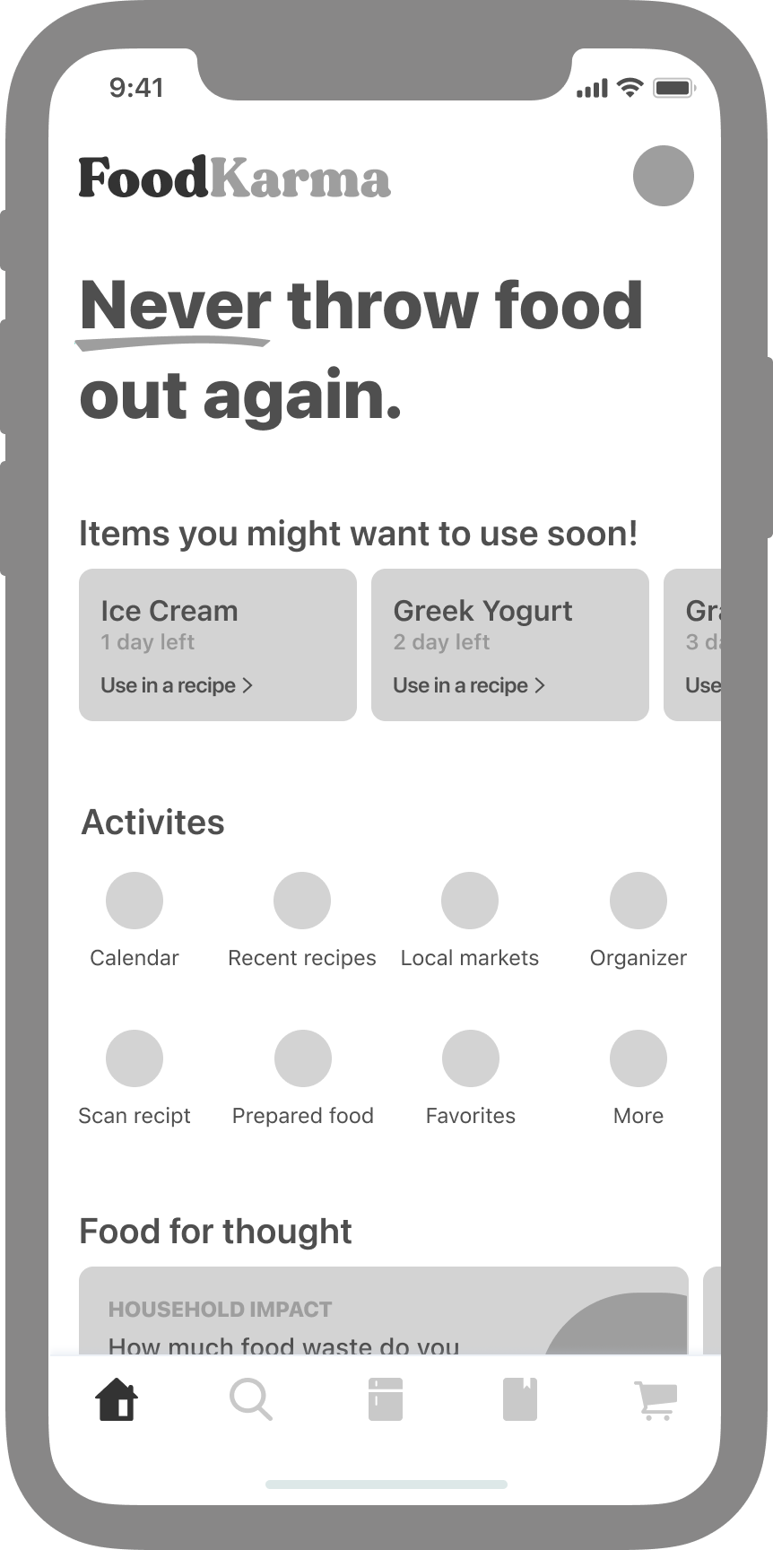
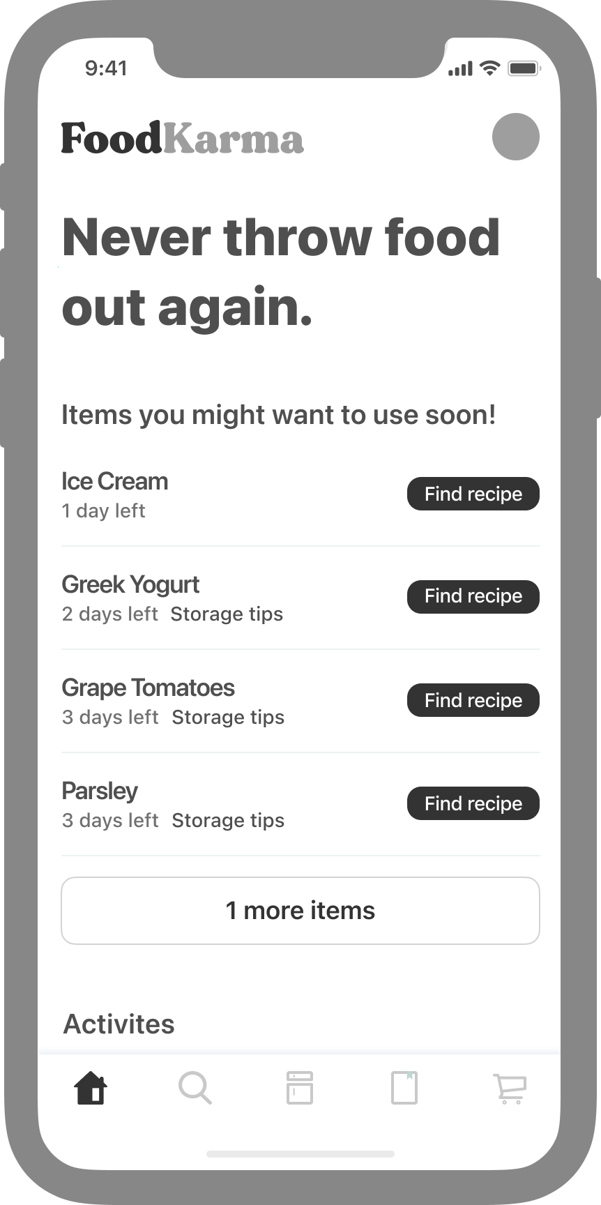
Food preservation page
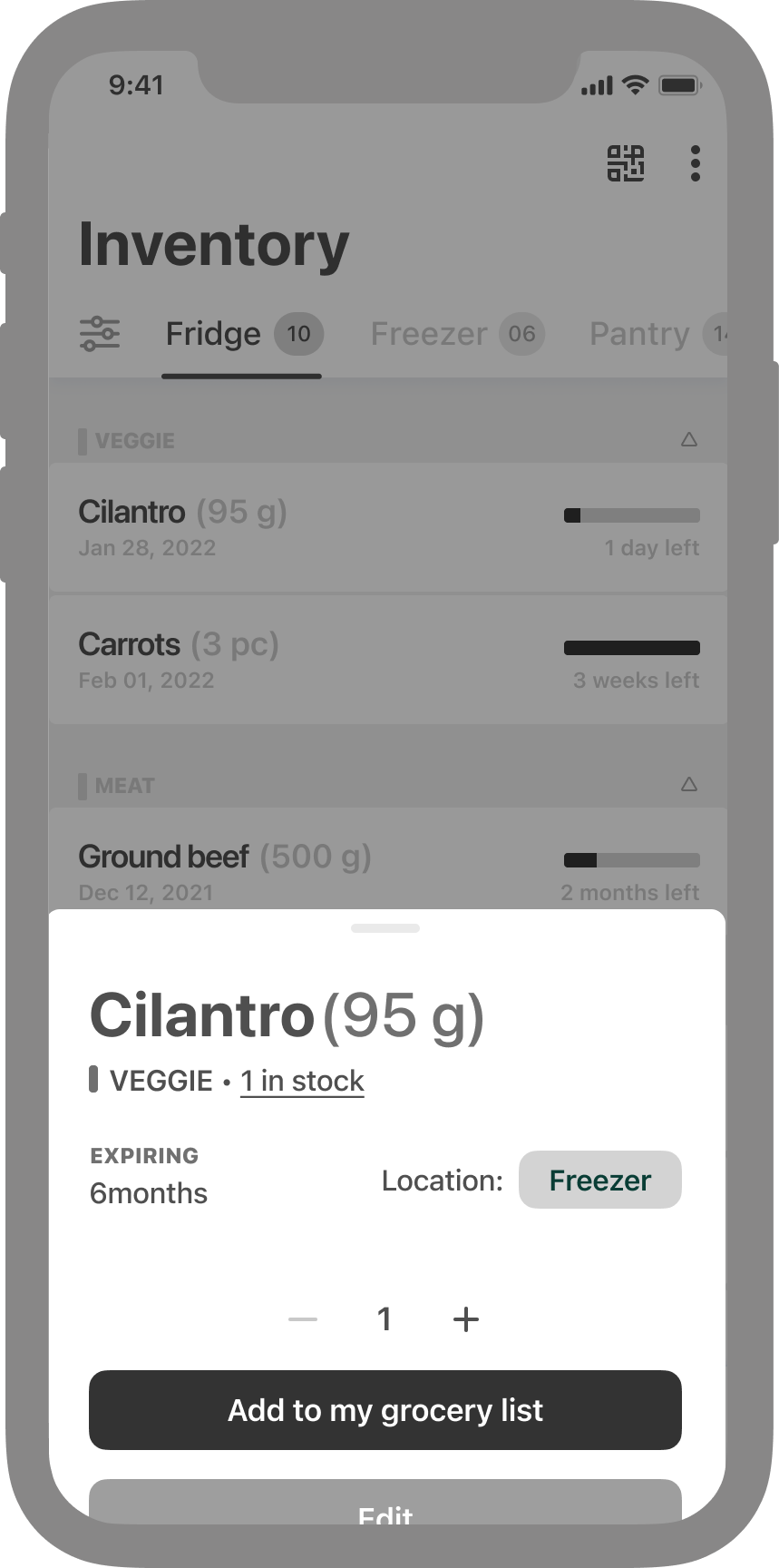
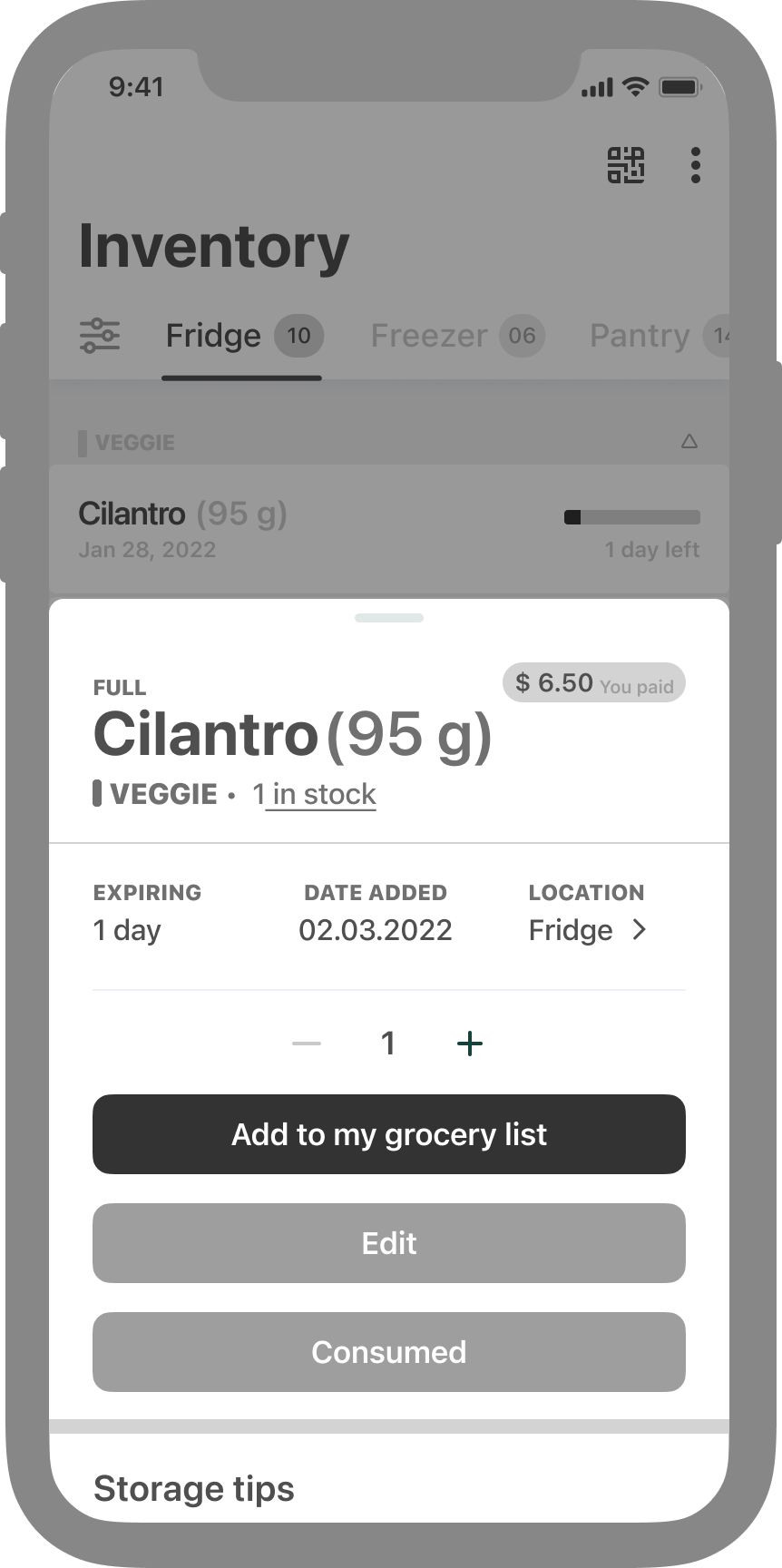
Household inventory page
Introducing Product Walkthrough
When conducting usability tests, I observed that some users were not fully utilizing key features in the FoodKarma prototype, leading to disengagement. Recognizing the critical importance of an excellent first experience in the activation phase of the product funnel, I implemented a product walk-through. This guided users through the main features, improving learnability without introducing unnecessary complexity
MEASURING THE DESIGN
Validation
The key performance indicator (KPI) for product usability and the behavioral metric for user experience is 'Task on Time.' The following figures, measured in seconds, represent the average across all 10 participants.
"Save time on finding ingredients and recipes that will reduce food waste"
Time on Task #1
Time on Task #2
Locate two items in your kitchen inventory that are expiring soon (within 1-2 days).
Find a recipe that incorporates two or more soon-to-expire items from your kitchen inventory (expiring in 1-2 days).


Conclusion
While it may not be a completely unbiased test, FoodKarma leverages powerful algorithms to streamline various tasks. This efficiency is a key feature of the app, aiming to reduce task times and enhance usability, ultimately fostering a more sustainable approach to home cooking and minimizing food waste in households

Preventing kitchen waste, ensuring freshness every time
FoodKarma assists households in tracking and managing their food inventory efficiently, saving time, and promoting home cooking. By offering curated recipes and sending just-in-time push notifications for items about to expire or needing attention.
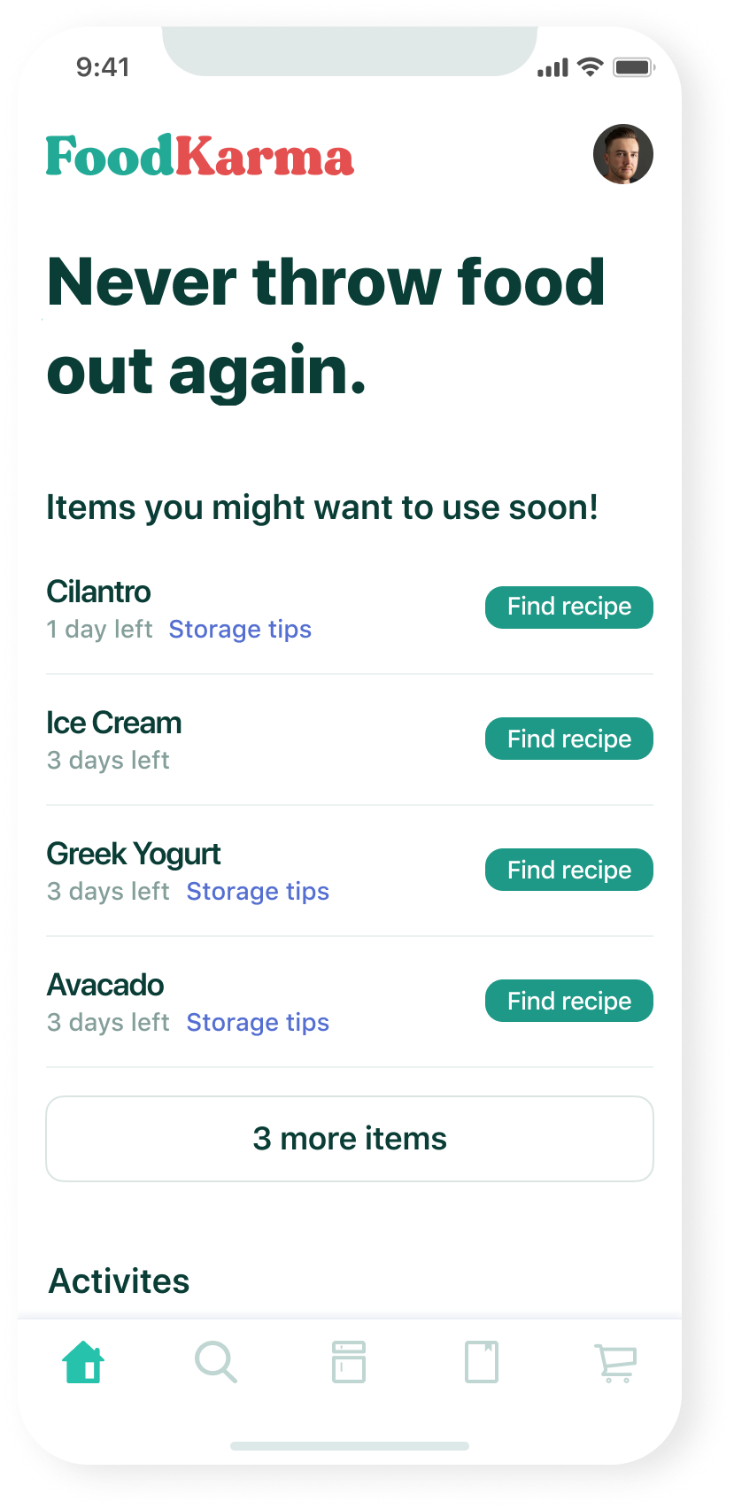
Instant Ingredient Insight and Recipe Suggestions
Swiftly identify expiring ingredients and receive relevant recipes or storage tips.
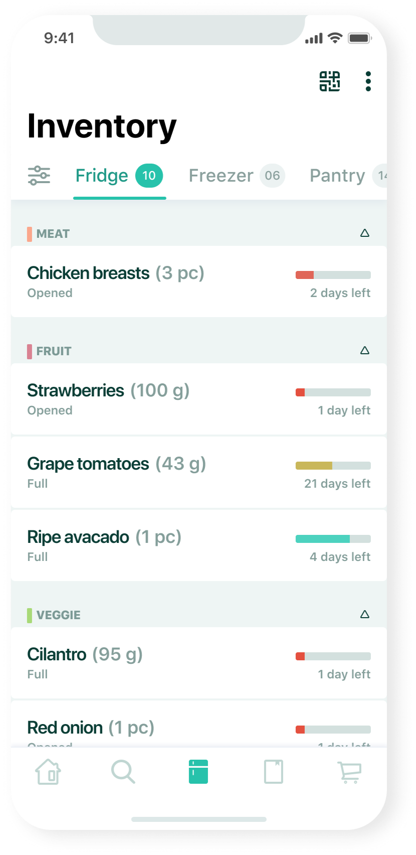
Centralize your Food Inventory Effortlessly
Easily identify what's in stock, quantities, expiration dates, and storage locations within your household. Prioritize expiring ingredients with a shelf life countdown at the top for quick and efficient management.
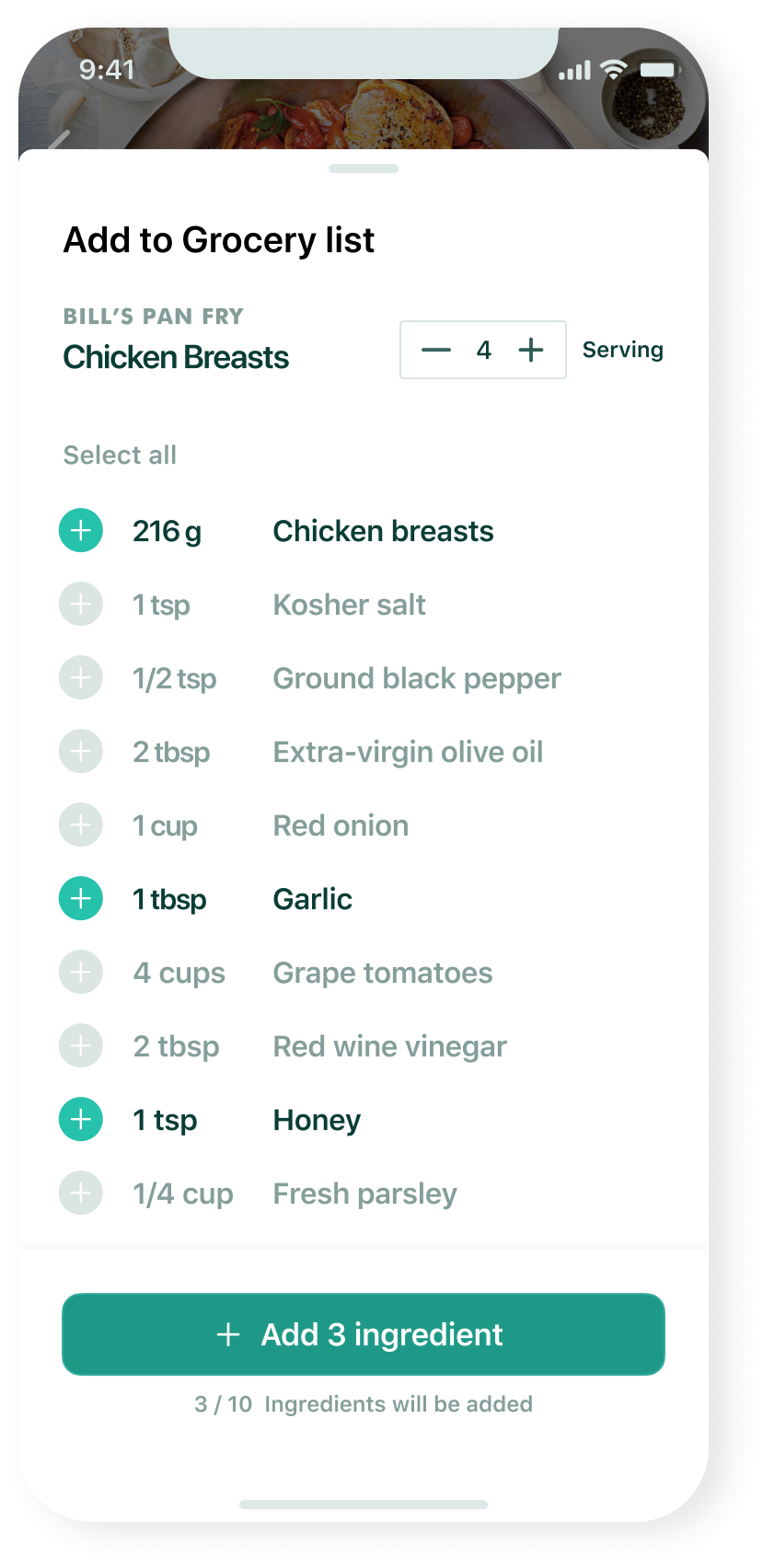
Effortless Meal Preparation: Streamlining your Shopping List with FoodKarma
Discovered a recipe you love? When adding it to your grocery list, FoodKarma automatically preselects the ingredients you still need, excluding the ones you already have in your household inventory. Simply add the selected ingredients, and you're all set for your grocery trip.
Custom Culinary Creations
Recipes crafted for you: Explore suggested recipes that prioritize ingredients nearing expiration. Discover money-saving recipes designed to utilize ingredients you already have, potentially saving you money and a trip to the grocery store.

Challenges
Identifying potential users for interviews and usability tests during the COVID lockdown posed a challenge. To overcome this, I utilized video chats for moderated usability tests, guiding users through the prototype remotely. Additionally, I explored online platforms and social media to connect with participants for user interviews
Retrospective
Recognizing the importance of thorough participant recruitment and screening for user research and usability tests, I acknowledge that time constraints impacted my selection process. In hindsight, dedicating more time to this phase would have been beneficial to minimize inherent bias. Using a screening survey could have improved the selection of candidates, ensuring a more suitable fit for the research study.
Selected Works

Diablo ImmortalsEvaluating the current player experience

Call of Duty - MobileD1 Retention Analysis
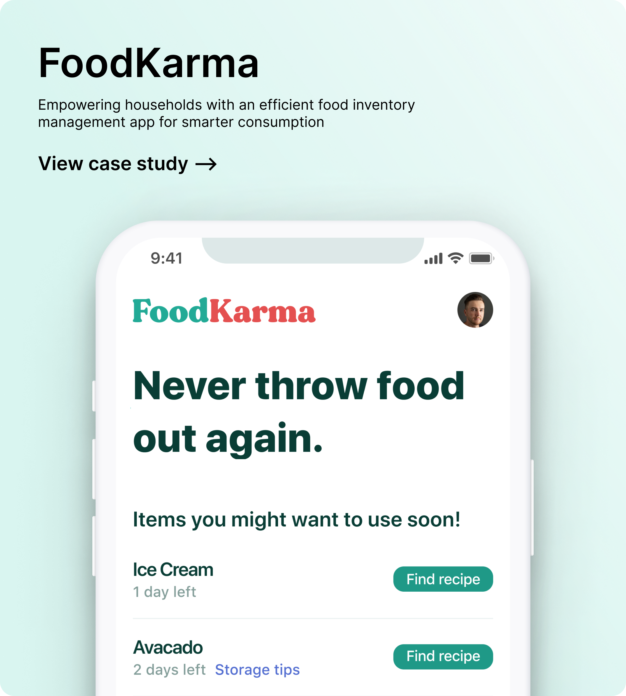
FoodKarmaFood waste management app
(OLD) Zencity - EngageRedesigning the whole project building experience
Zencity - EngageAutomated setup for Engagements

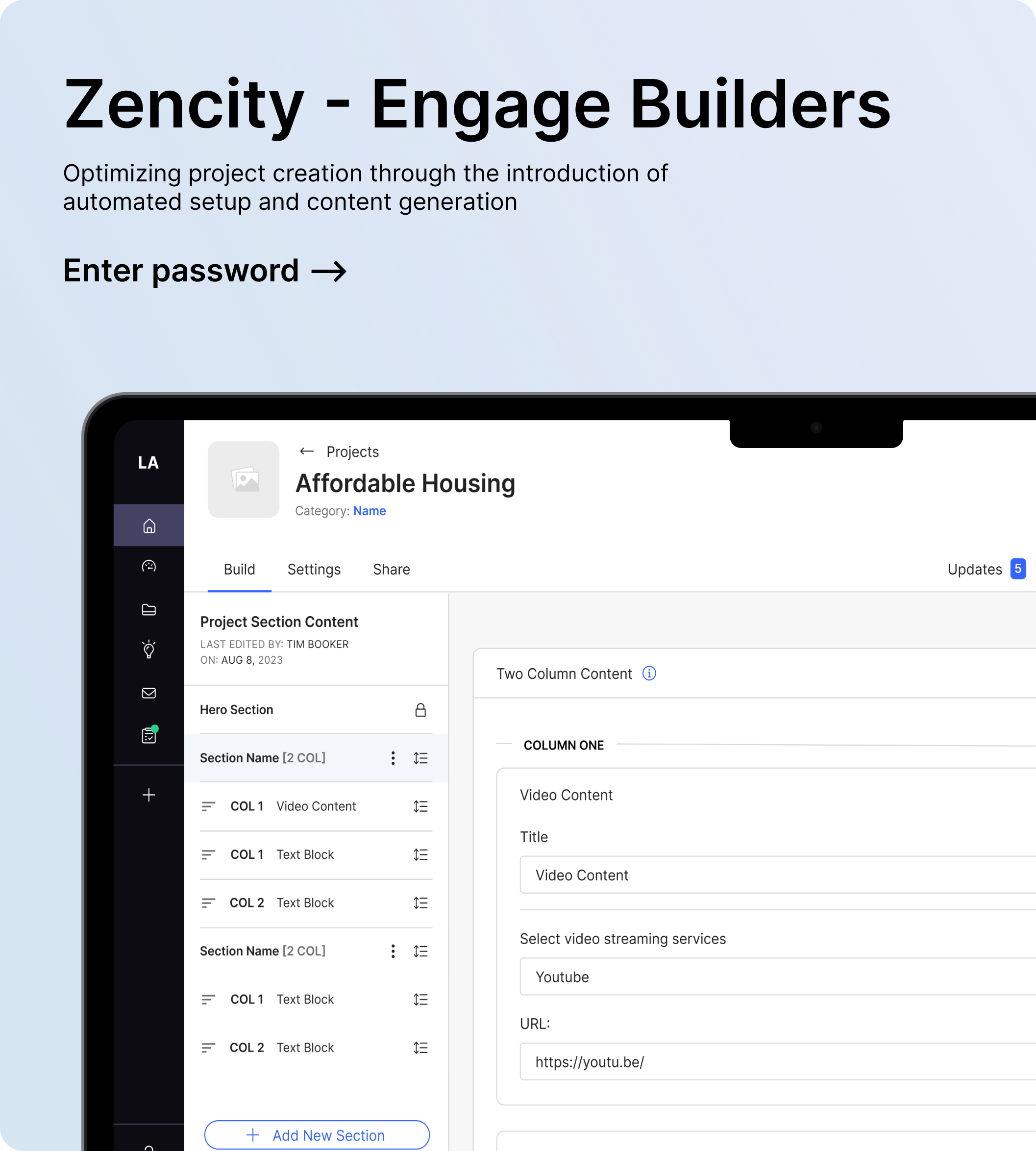
Zencity - Engage: BuildersRedesigning the whole project building experience

